Every font you use evokes different emotions. So choosing the right fonts plays a big role in any project. In times of web fonts, it has been no problem for quite a while to use your house fonts on your own website.
Typography can have an effect on us, it can evoke feelings and it can steer us mentally in a certain direction. Large companies and corporations in particular take advantage of this. I would divide the different fonts into 5 groups (this is not about classification). For web use, these would be: Serif, Sans-Serif, Script, Modern and Display Fonts.
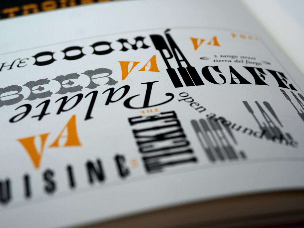
The effect of serif fonts
Effect of fonts in web design – example Serif
Examples of well-known serif fonts are Frutiger Serif, Garamond, Palatino or Baskerville. These can look especially traditional, respected, reliable and comfortable. The best known professional group for the use of classic serif fonts are probably lawyers. But the fashion and hotel industries also make use of the effect. Exactly where people place special emphasis on tradition, security and professionalism. Another good option is to combine a serif for headlines/displays and a sans-serif for body text. However, it is essential that the two fit together characteristically.
Effect:
- traditional
- respects
- reliable
- comfortable
- safe
- professional
Well-known serif fonts:
- Frutiger Serif
- Garamond
- Palatino
- Baskerville
The effect of sans-serif fonts
Popular fonts are for example Futura, Avenir, Helvetica, Gotham, Franklin Gothic or Neuzeit. They look modern, timeless, clean, stable and objective. Many young and forward-looking companies use Sans-Serif fonts. They are ideal for innovative industries, as they want to appear friendly and inviting. Online, the advantage is also good readability (the most important factor). Furthermore, they can also convey calmness, constructiveness and objectivity. In other words, an excellent all-rounder that always works when in doubt.
Effect:
- modern
- timeless
- stable
- objective
- calm
- constructive
- objective
Known sans-serif fonts:
- Futura
- Avenir
- Gotham
- Franklin Gothic
- Modern times
The effect of Script Fonts
By far the best known font in this group is probably Zapfino. Others would be LinoScript, Kaufmann, Mistral or Pepita. As with all other groups, there are thousands and thousands of script fonts to choose from. MyFonts alone lists 3867 fonts in this category! The effect can be very different with script fonts due to their rather irregular features. Affectionate, elegant, sophisticated or creative. The main point is to imitate the natural strokes of handwriting. Typically, these fonts are used more in logos or headlines, as they are not suitable for longer texts due to curved initial letters and embellishments. Areas of application can be, for example, companies from the luxury sector. But script fonts are also often used in the field of craft beer, roasteries or organic products due to the personal character of a handwritten font. This trend has been quite noticeable, especially in the last year.
Effect:
- tender
- elegant
- sophisticated
- creative
- luxurious
- alternative
Known script fonts:
- Zapfino
- LinoScript
- Kaufmann
- Mistral
- Pepita
The effect of Modern Fonts
This group is also about Sans-Serif fonts, but more about the constructed or geometric ones. These fonts are the absolute hit in the SaaS and design industry. Well-known representatives are Century Gothic, Gilroy, FF DIN or ITC Avant Garde Gothic. The effect is modern, progressive (or pioneering, future-oriented), strong, stylish and chic. True to the motto “form follows function”, these fonts create a clean and clear impression thanks to their clean geometric lines. Combined with thoughtful details, this allows you to create a cool and contemporary atmosphere.
effect:
- modern
- progressive
- groundbreaking
- future-oriented
- strong
- stylish
- chic
Well-known Modern fonts:
- Century Gothic
- Gilroy
- FF DIN
- ITC Avant Garde Gothic
The effect of display fonts
The last group must be used very carefully. A display font is not only used as a corporate font, but often as a design element in its own right. These fonts are intended for use with large headlines and messages (for example, on posters or brochures). Stylistically, these fonts can go in many directions, sometimes calligraphic, hand-painted, or otherwise experimental. Well-known representatives of this group are Bromley, Haggerston or Limehouse. Due to their individual characteristics, these also have a special effect and stand out. This is also the reason for using a display font.
Effect:
Display fonts can be so diverse that it is impossible to list fixed values or properties for this category. Depending on the font you choose, you can very well use the above examples as a guide.
Known display fonts:
- Bromley
- Haggerston
- Limehouse
Conclusion
Despite these rules, there are certainly some refutations. Basically, all typefaces have an effect. Each typeface used simultaneously interprets the text, and much of the effect depends on personal preference, memory, or experience. Nevertheless, some things can definitely be generalized. Since we don’t know most of our visitors personally, we inevitably have to stick to general concepts and statements. When working actively with fonts, it is important to be aware of the effect.